
Your creative team is producing assets. The ads look decent. The landing pages are on brand. But click-through rates are mediocre and the creative fatigue cycle is brutal. Every two weeks you need fresh ads, and every batch seems to perform about the same.
The problem is rarely that your design team lacks talent. It is that the design execution has blind spots that quietly drag down conversion. These are not ugly ads. They are ads that look fine but fail to stop the scroll, communicate the message, or drive the click.
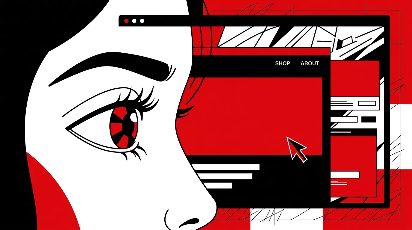
Performance creative design requires a different set of priorities than traditional brand design. Here are the mistakes we see killing conversion rates across the accounts we audit.
Mistake 1: Designing for aesthetics instead of performance
Beautiful design and high-performing design are not the same thing. We see this constantly. A creative team produces polished, on-brand ads that win internal approval but get ignored by the target audience.
Performance creative design starts with the question "What will make someone stop scrolling?" not "What looks best in a presentation?" Those are fundamentally different briefs.
What this looks like in the data:
- High impression counts, low engagement rates
- Creative that performs well for brand awareness but poorly for direct response
- A/B tests that show "ugly" variations outperforming polished ones
The fix is not to make worse-looking ads. It is to design for attention first, then refine for brand.
Mistake 2: No visual hierarchy in ad creative
Every ad needs to communicate three things in under two seconds: what this is about, why it matters, and what to do next. If your ad creative tries to give equal visual weight to every element, nothing stands out.
Common hierarchy failures:
- Headline competes with the image: Text and visuals fight for attention instead of working together
- Too many focal points: Multiple callouts, badges, and text blocks create visual noise
- CTA is buried: The button or action prompt is small, low-contrast, or positioned below the fold
A strong ad has exactly one primary focal point. Everything else supports it.
| Element | Common Mistake | High-Performing Approach |
|---|---|---|
| Headline | Small text, centered, safe | Large, bold, offset for contrast |
| Image/Visual | Stock photo, generic | Specific, showing the outcome |
| CTA | Small button, bottom of frame | High-contrast, clear next step |
| Supporting text | Long paragraph | 1-2 lines max, benefit-focused |
| Logo | Prominent, top-center | Present but not dominant |
Mistake 3: Inconsistent brand design across channels
Your Facebook ads use one style. Your Google Display ads use another. Your landing pages use a third. Each one looks professional in isolation, but together they create a fragmented experience that erodes trust.
Brand design consistency is not a vanity metric. It directly impacts conversion. When a prospect clicks an ad and lands on a page that looks and feels different from what they just saw, there is a moment of cognitive dissonance. Some percentage of those prospects will bounce because the transition felt wrong.
What consistent brand design looks like in practice:
- Same color treatment and typography across ads and landing pages
- Visual style of photography or illustration matches across touchpoints
- Layout patterns feel related even when formats differ
- The prospect never questions whether they are in the right place
Mistake 4: Not designing for platform specifications
Each advertising platform has different format requirements, safe zones, and user behavior patterns. Designing one master creative and cropping it for different placements is a recipe for mediocre performance everywhere.
Platform-specific considerations we see teams miss:
- Meta feeds: Text gets truncated. Key messaging must be in the image, not just the ad copy.
- Stories/Reels: Vertical format. Safe zones for UI elements. Motion beats static.
- Google Display: Dozens of size combinations. Auto-generated responsive ads require assets that work at multiple aspect ratios.
- YouTube: First 5 seconds are everything. The thumbnail is a separate design challenge.
Treating each placement as its own design problem is more work upfront but significantly impacts performance.
Mistake 5: Creative fatigue without a testing framework
Every ad has a shelf life. Performance degrades as frequency increases. But most teams respond to creative fatigue reactively. Performance drops, they scramble to produce new creative, and the cycle repeats.
A structured graphic design system prevents this by building testing into the production workflow:
- Launch with 3-5 creative variants per campaign, not one
- Rotate creative on a scheduled cadence (weekly or biweekly for high-spend accounts)
- Test one variable at a time: Change the headline treatment, or the image, or the color scheme. Not all three.
- Document what wins: Build a creative performance database that informs future design decisions
- Retire proactively: Pull creative before performance crashes, not after
Teams with a testing framework spend less time in emergency creative mode and more time iterating on what works.
How to audit your creative for these mistakes
Run this check against your top 10 highest-spend ad creatives right now:
- Does each ad have a clear visual hierarchy with one dominant focal point?
- Can you understand the message in under 2 seconds?
- Is the CTA visible and specific?
- Does the ad match the look and feel of the landing page it sends traffic to?
- Was the ad designed specifically for the platform and placement where it runs?
If you answer "no" to two or more questions for any ad, that creative is likely underperforming relative to its potential.
Frequently asked questions
How do we balance brand guidelines with performance optimization?
Brand guidelines set the boundaries. Performance optimization works within them. You should never have to choose between on-brand and effective. If your brand guidelines are so rigid they prevent testing, the guidelines need updating. Not the other way around.
How many creative variants should we test per campaign?
For most accounts, 3-5 variants per ad set is the sweet spot. Fewer than that limits your learning. More than that spreads your budget too thin to reach statistical significance on any single variant.
Should we use stock photography or custom visuals?
Custom almost always outperforms stock for direct response. If custom is not feasible, use stock imagery that is specific and situational rather than generic and posed. A real jobsite photo outperforms a stock handshake image every time.
How often should we completely refresh our creative approach?
Major creative refreshes (new visual direction, new messaging framework) should happen quarterly. Within each quarter, you should be rotating individual ad variations weekly or biweekly to stay ahead of fatigue.
Design for clicks, not for compliments
The only creative review that matters is the one your audience gives you with their clicks and conversions. Stop designing ads to impress your team and start designing them to move your market.
Talk to a Creative Director about building a performance creative system that drives measurable pipeline growth.
References
- Meta Business Help Center, "Creative Best Practices for Ads"
- Google Ads Help Center, "About Responsive Display Ads"
- Nielsen Norman Group, "Visual Hierarchy in Ad Design"